Numerical Weather Prediction Resources
Special | A | B | C | D | E | F | G | H | I | J | K | L | M | N | O | P | Q | R | S | T | U | V | W | X | Y | Z | ALL
C |
|---|
| LP | Cloud Formation Processes | |||
|---|---|---|---|---|
Source: COMET Module, "Influence of Model Physics on NWP Forecasts" Importance of cloud thickness and cloud parameterization processes on model precipitation output.
Additional Resources: | ||||

D |
|---|
| JH | Data Assimilation Process | |||
|---|---|---|---|---|
Source: COMET Module: "Understanding Data Assimilation" Appropriate Level: Some graphics and concepts could be used in introductory classes but the core content is appropriate for upper division majors Outline of Module 1. Data Assimilation Process. A yes/no question that can be skipped 2. Data Assimilation Wizard. Motivation for data assimilation that may appeal to some 3. Data/Observation Increment/Analysis. The core of the module is contained in these three sets of pages. Graphics and simple examples help to highlight critical concepts (a handful of busted links to NCEP operational resources in the Data section). Graphics shown below summarize the components of the data assimilation process. Step 1. Observations received and processed  Step 2. Deviations between the observations and background values are computed  Step 3. Observation increments are used to adjust the background  4. Operational Tips/Juding Analysis Quality. Brief review on some issues associated with assessing analysis quality. 5. Exercise/Assessment. Ordering the steps involved in data assimilation leads to the resulting graphic of the end-to-end process (below).  Other relevant COMET resources: Operational Models Matrix: Brief overviews of operational data assimilation systems are listed at the bottom. Good Data/Poor Analysis Case Study: Very nice illustration of some of the issues associated with objective analysis/data assimilation. WRF Model WebCast: Provides very useful information on the Gridded Statistical Interpolation (GSI) assimilation approach used in the NCEP NAM. | ||||
E |
|---|
| JH | ECMWF Training on Data Assimilation | |||
|---|---|---|---|---|
Source: ECMWF Training Material Level: Instructor Technical information on data assimilation as applied at the ECMWF. | ||||
| JH | Ensemble Filters | |||
|---|---|---|---|---|
COMET Module: None on this subject yet Appropriate Level: Graduate level Ensemble Filters for Geophysical Data Assimilation: A Tutorial by Jeff Anderson. Data Assimilation Research Testbed This is an excellent, but technical, introduction to ensemble modeling. | ||||
Ensemble Forecasting | ||||
|---|---|---|---|---|
COMET Module: "Ensemble Forecasting Explained" (2004) "The assumptions made in constructing ensemble forecast systems (EPS) and the intelligent use of their output will be the primary focus of this module. In order for you to better understand EPS output, we will also look at some necessary background information on statistics, probability, and probabilistic forecasting." Appropriate Level: Advanced undergraduate and above. Summary comments: Lots of text, some of which can be dense (when the concepts described are relatively challenging). Simple, mostly static diagrams provide clear illustrations. Assessment exercises (multiple choice and multiple answer questions, with feedback) help. Quite a few ensemble forecast products and verification tools are described. Basic concepts of probability and statistics underly most of these (as befits the topic), and an attempt is made to provide some background about these, but a basic statistics course would be a valuable prerequisite to this material. A COMET webcast by NCEP's Dr. Bill Bua offers a simpler, one-hour introduction to a subset of the material in this module, "Introduction to Ensemble Prediction"; for most users unfamiliar with ensemble forecasting, I recommend viewing the webcast before completing the module. Preassessment. This module starts with a randomized, 15-item pre-assessment quiz, which the user repeats at the end of the module as a measure of what the user has learned. The pre-assessment quiz therefore should provide a preview of at least some of the module's content. The mostly (entirely?) multiple-answer quiz questions include graph and weather map interpretations and verbal questions about aspects of ensemble forecasting and its applications. The questions, graphs and maps--and hence necessarily the module itself--use language and invoke concepts technical enough to be well out of the reach of beginning students. Here's an example of a graph with very limited explanation offered to help the user interpret it (which of course is the point--the user presumably will learn more about it in the module):  (The user is asked about the resolution and reliability of the two forecasts depicted in the graph.) Depending on the degree of support provided by the instructor and the module itself, the preassessment suggests that upper division majors should be able to learn something from the module. Taking the preassessment quiz yourself is one way of judging whether the module content as it stands is appropriate in content and level for your students. Warning: although the preassessment strikes me as a useful pedagogical tool (for measuring learning progress and offering a preview of the module content), completing it can be discouraging unless users understand that they aren't expected to do well on it and that they should look forward to learning enough from the module to improve dramatically. Introduction.
| ||||
Ensemble Forecasting: Information Matrix (NCEP) | ||||
|---|---|---|---|---|
COMET Module: "Ensemble Prediction System Matrix: Characterics of Operational Ensemble Prediction Systems (EPS)" (updated as needed) "This matrix describes the operational configuration of NCEP EPS, including the method of perturbing the forecasts (initial condition or model), the configuration(s) of the model(s) used in the EPS, and other operationall significant matters." Appropriate level: Advanced undergraduate and above. Summary comments: This module is not an instructional module but is rather a matrix of hypertext links to information about aspects of NCEP's medium range and short range ensemble forecasting systems, including perturbation methods, characteristics of the models used, and postprocessing and verification. Some of the informational Web pages are illustrated with simple, clear diagrams, and some links lead to the "Ensemble Forecasting Explained" module (see entry in this glossary under "Ensemble Forecasting"). For students already familiar with the basics of how numerical weather prediction systems work and how numerical models are formulated, the matrix provides a useful way to investigate these topics in more detail, at least for NCEP's ensemble forecasting system. Some explanations are illustratrated with clear and easy to read, albeit static, graphics. Instructors might find some of these explanatory Web pages useful for instructional purposes, such as assigned reading. | ||||
Ensemble Forecasting: Webcast Introduction | ||||
|---|---|---|---|---|
COMET Webcast: "Introduction to Ensemble Prediction" (2005) This one-hour webcast by NCEP's William Bua "introduce[s] concepts in the COMET module Ensemble Forecasting Explained" (see the glossary entry for the module). Appropriate level: Advanced undergraduates and above. Summary comments: Dr. Bua's webcast presents a subset of the concepts presented in the Ensemble Forecasting Explained module. Generally speaking, the webcast treats its topics more simply than the module does. Quizzes with feedback, including a preassessment, are interspersed throughout. Viewing the webcast first should make completing the module, which is text intensive and sometimes conceptually challenging, easier. | ||||
F |
|---|

G |
|---|
| JH | Gridded Statistical Interpolation | |||
|---|---|---|---|---|
COMET Module: Technique mentioned only in passing Level: Graduate level Journal article (Wu et al. 2002 MWR) that provides a technical description of selected aspects of the gridded statistical interpolation used in the NCEP GFS model. A version of this 3-dimensional variational approach is also used in the 2-D real time mesoscale analysis (RTMA). | ||||
I |
|---|
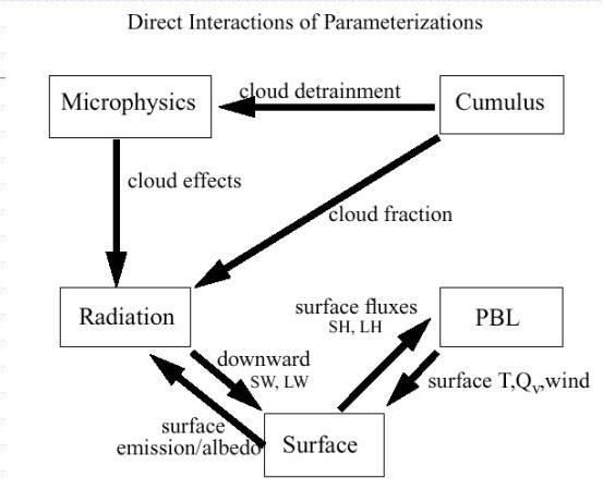
| SC | Interactions of Parameterizations | |||
|---|---|---|---|---|
Module: Influence of Model Physics on NWP Forecasts
| ||||
M |
|---|
Minimum Error Variance | ||||
|---|---|---|---|---|
One of the prime equations for data assimlation is the Kalman Filter Equation. This equation is: x(a)-x(f) = PH(T){HPH(T)+R}(-1)[d-Hx(f)] Where x(f) is the forecast, x(a) is the analysis, P is the background error covariance matrix, and R is the observation error covariance matrix. x(a) and x(f) are vectors, containing every model variable at every model gridpoint. P gives the information regarding errors of the model first guess field R gives information about the errors of observations (instrument and representativeness errors). This equation, and the notion of 'covariance matrices', is often a little overwhemling. It can be simpler to consider the case of trying to best know the value of one variable. For just one variable... T(a) - T(f) = s(f)**2/(s(o)**2+s(f)**2)*[T(o)-T(f)] Each term in the equation for one variable has a match with the full blown Kalman Filter equation. T(a) is the analysis value (best estimate), as is x(a), T(f) is the model first guess, as is x(f). And so on. Consider the temperature of the air at 500mb over Denver Colorado. To estimate this value, T(a) (a for 'analysis') we have two estimates: #1 is the value as reported from the DNR sounding.  I'll call that T(o) (o for 'observed') Using known history, the average error of these observations has an error variance s(o)**2 #2 is the value from the model first guess field  I'll call that "T(f)" (f for 'first guess') Using known history, the average error of these observations has an error variance s(f)**2 Here is where the graphic comes in! The graphic I am envisioning is rather similar to this one:  This graph would be re-worked such that instead of FCST A and FCST B, we have First Guess (T(f)) and Observation (T(o)) The applet I am envisioning is something that can be changed from the image on the left to the image on the right. Sliders (as well as text entires) will allow the user to adjust both the values of T(f) and T(o) as well as the error variances s(f)**2 and s(o)**2. Also there would be a box showing the value of T(a). What if our forecast model was always perfect? In that case, the error variance of the observations, s(f)**2, would be zero. In that case, the equation would collapse to T(a)-T(f) = [T(o)-T(f)]*(0), or T(a)-T(f)=0. At this time, the image would show that T(a) and T(f) are the same value, and that the spread (the tails of the Gaussian curves in the figure above) would be zero. Consider now the other extreme, where the observations are perfect (but the forecast is not). In that case, the equation becomes T(a)-T(f) = [T(o)-T(f)]*(s(f)**2/s(f)**2), or T(a)-T(f)=T(o)-T(f), and thus, T(a)=T(o). Users could adjust the values of the error variances. The 'analysis value', T(a) would move towards whichever value (T(a) or T(f)) had a smaller error variance associated with it. As the error variances were increased, the picture would look more like the right side of the above image. If error variances were decreased, the image would look more like the figure on the left of the above image. Included with the estimate of T(a), the actual value, there would be a Gaussian shape around it with variance equal to [1/(s(o)**2+s(f)**2)](-1), showing that when the error variances of the two estimates are small, the error variance (uncertainty) of the analysis is also small. This module will show the correlation between error statistics of the two estimates (first guess and observation) and the analysis value. | ||||
N |
|---|
NWP Misconceptions | ||||
|---|---|---|---|---|
COMET Module: "Ten Common NWP Misconceptions" (2002-2003) Ten common misconceptions about the way NWP models work and hence how they can be interpreted, plus explanatory corrections of those misconceptions, plus quite a bit of more or less related material. Appropriate level: Advanced undergraduates and above. Summary comments: This module is heavily illustrated, has audio narration, and is very light on text. (A print version substitutes text for the audio narration; animation is lost but static color graphics remain.) A "Test Your Knowledge" section, with feedback, ends the presentation of each misconception. Each misconception is a kind of Trojan horse; the misconception is addressed directly, but it is also used as an excuse to present quite a bit of less narrowly (but still at least broadly) relevant material. The misconceptions vary in their degree of obscurity, but at least some of them look potentially useful for use in a basic NWP course that doesn't focus exclusively on theory. However, to appreciate the misconceptions and the corrections to them, students need already to know the basics about how numerical models are formulated and used, and in some cases more than that--some of the misconceptions are quite specific, as the titles below probably suggest. At least one of the misconceptions (I didn't examine all of them closely), "A 20 km Grid Accurately Depicts 40 km Features" (#3 below), makes important points about model resolution, but its examples cite values relevant to 2002-2003 era models and so are not as directly relevant today as they were then. Several "misconceptions" refer to the eta model, which few students henceforth will recognize. The general concepts remain highly relevant, however. Misconceptions addressed include:
| ||||
 (Discussion of the complexity of representing radiative processes in a model, including the effects of clouds and clear-sky biases in the eta model--hope this gets updated! Brief summary of how models address
O |
|---|
| JH | Operational Model Matrix | |||
|---|---|---|---|---|
COMET Module: Operational Models Matrix Appropriate Level: Upper division and graduate level Overview An excellent resource to contrast the basic features of U.S. (and one Canadian) operational models. Links to relevant COMET modules and other on-line resources are provided. Information on many characteristics of the NMM-NAM remain to be added. | ||||
R |
|---|
Resolution Applet | ||||
|---|---|---|---|---|
A significant concept to numerical weather prediction is resolution. The notion is that at a higher resolution, more features can be represented by a model. However, this increased resolution comes at additional computational expense. Take, for example, a tropical cyclone. Below is an image of Hurricane Fran, at 1km resolution.
Note the structure that is visible: the details of the eye, for example. I am envisioning an applet that allows the user to choose the resolution via some sort of slider. The image will be 'radar' like image. This image, at 1km resolution, covering a 512km by 512km domain, will clearly show the structure of the eye-wall and of the outer rain bands. Using the slider, one can choose to degrade the resolution. Choices for resolution will be 1km, 2km, 4km, 8km, 16km, 32km, 64km, and 128km. Thus, at the coarses resolution, there are only 16 pixels, whereas at 1km resolution, there are 262144pixels (512**2) When the slider is moved from one resolution to another, the "radar" image changes to that resolution. I believe that images can be made using IDV, but just changing how many pixels are shown. One can choose to use them all, every 2nd, every 4th, etc. (Kelvin demo for LEAD). The changing image will show the consequences of resolution reduction: the eye wall structure will decay, and at somepoint, the eye will not be discernable. In addition to the image changing, there will be a text readout of the number of pixels. For example, for a resolution of 4km, nx=128, ny=128, and the total number of pixels is 16834. Beside this number of pixels, there will be a 'model computing time'. For example, we could assume that at 128km resolution, the model will take 1 minute to run. Assuming that a halving the resolution leads to 4x gridpoints, and making the time step 1/2 as long, a 64km run would then take 16 minutes. In the limit, the 1km resolution would take 16384 minutes, (over 11 hours). This model computing time would be expressed as a common clock. The number of time would be 'shaded'. For instance, if the model would take 1 hour to run, the clock would read 1pm, with the area of the clock from Noon to the hour-hand being shaded in. The two dramatic visuals would be the image being sharper or more degraded, and the clock. The idea is to incorporate, but improve upon, images such as this:
An important point is to make sure that the false idea (misconception!) that a 1km model will resolve a 1km feature is not communicated. Not sure how to do that... | ||||


S |
|---|
Spectral Wave Addition | |||
|---|---|---|---|
A concept that is difficult to get across is how a seeming random wave can be deconstructed into a series of sine waves. The image below is a little old, but gives a great visual of the process:
For the 'mark 2' version, I envision an applet that looks like this, but has, perhaps, 4 different lines. The top 2 lines would be sin(x) and cos(x) on the top line (much like the sin(2x) and sin(5x) on the top line of the above image), sin(2x) and cos(2x) on the second line. The third would be the sum of the four waves above, similar to the bottom line on the above image. Each of the top 4 waves would have an 'amplitude slider', where one could alter the amplitude of each of the waves. For instance, if one set the amplitude of 'sin(x)' to 1, and all the other waves (cos(x), sin(2x), cos(2x))to 0, one would get that same sine wave back on the bottom panel. By changing the amplitude of the 4 waves above, one can create increasingly complex patterns on the sum of the 4. I believe that the slider will need to be discretized, perhaps in increments of 0.25, to keep the number of possiblities low. To make this even more interactive, on the bottom (4th) line, would beith some sort of pre-determinied structure. The goal would then be for the user to manipulate the amplitudes of the top 4 waves (sin(x), sin(2x), cos(x), cos(2x)) until the sum of those 4 waves matched the 4th line. We could have a 'easy', 'moderate', and 'hard' option on this 4th line, with the easy being something like sin(x)+0.5*cos(x), and the 'hard' being a combination of all four above waves. The 'hard' one would try to match up with the observed longwave structure evidenced in the "Model Structure and Dynamics" module.
Thus, the 'hard' option of the three waves to try to match would be something resembling the wave in the above image. That might be hard to pull off with only 4 waves, but the motivation would be to show that a combination of something they can visualize (sin and cos) can represent the real, complicated, atmospheric flow field. | |||


T |
|---|
| SC | Ten Misconceptions about NWP | ||
|---|---|---|---|
Modules: Ten Common NWP Misconceptions Top Ten Misconceptions about NWP Models Appropriate Level: Advanced undergraduate and above. General Comments: These two modules are similar. Suggest to merge them together and keep it on METed website. | |||
| SC | Turbulent Processes | |||
|---|---|---|---|---|
COMET Module: Influence of Model Physics on NWP Forecasts This simple figure describes the planetary boundary layer processes in NWP models, which can be a supplement material this module.
(Source: WRF User's Workshop) http://www.met.tamu.edu/class/metr452/models/2001/PBLproject.html | ||||
