Statistics Lab Forum

Section 2: How does the correlation work?

Section 2: How does the correlation work?

de Marina Timofeyeva -
Número de respuestas: 23

You are responsible for identifying possible local climate signals for conducting local studies at your office. The Climate Diagnostic Center website is one possible resource for this investigation.

Go to: http://www.cdc.noaa.gov/USclimate/Correlation/.

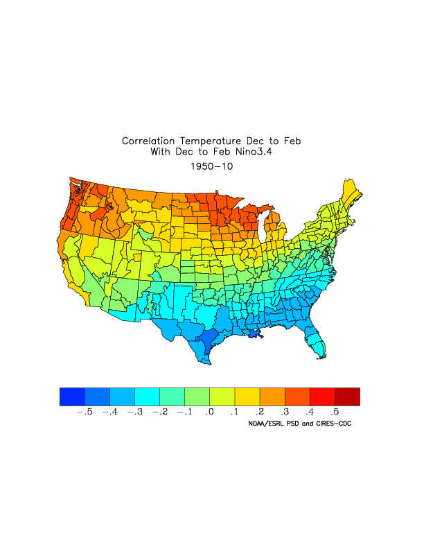
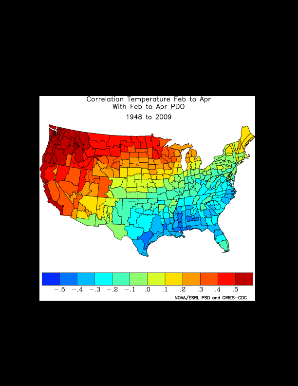
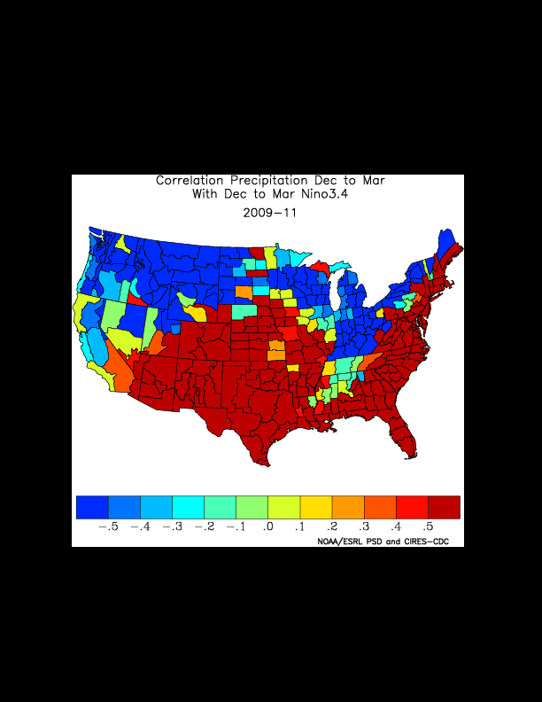
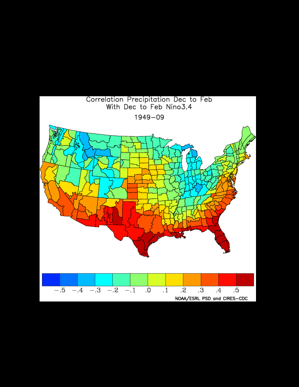
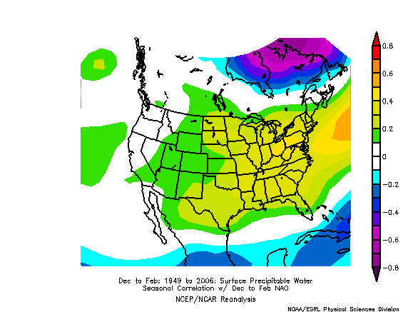
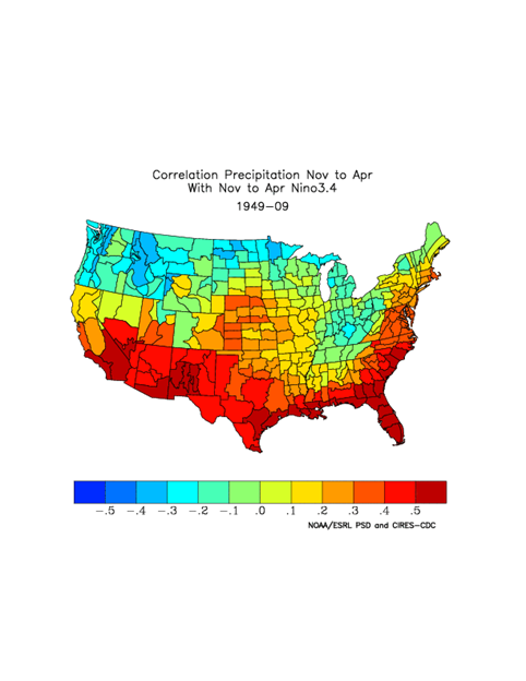
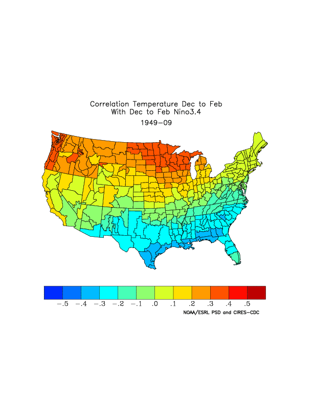
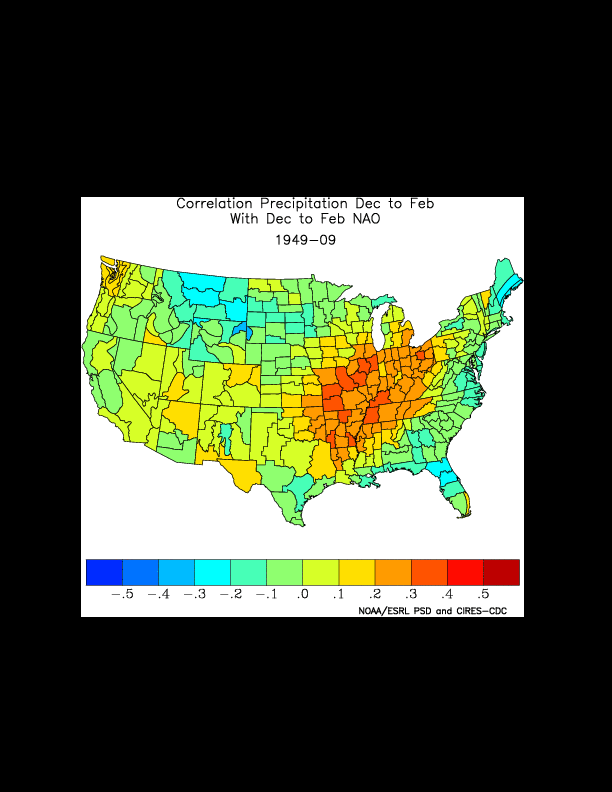
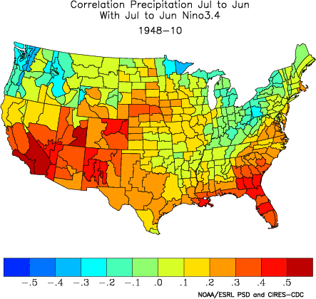
This is the Monthly/Seasonal Correlation Page, which allows one to plot correlations of US climate division data with atmospheric/oceanic time series. Please see an example here.

Another possibility is to go to: http://www.cdc.noaa.gov/Correlation/

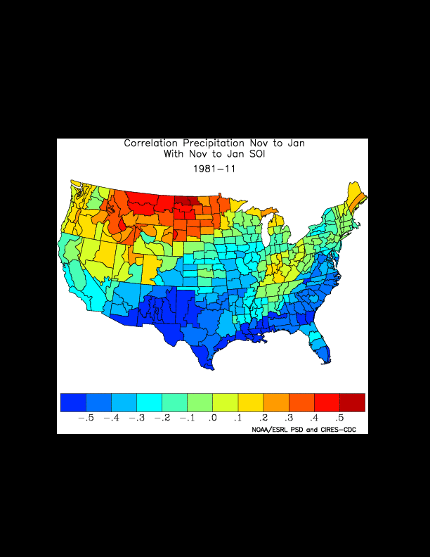
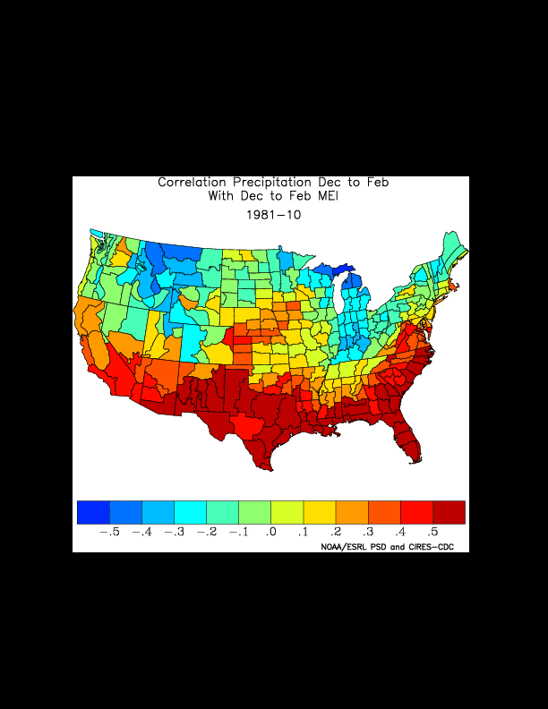
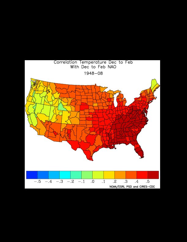
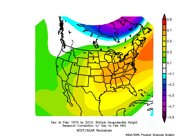
This is the Linear Correlations in Atmospheric Seasonal/Monthly Averages Page, which allows one to plot correlations and regressions of atmospheric variables, using NCEP Reanalysis Data, with atmospheric/oceanic time series. Please see an example here.

After you see the example, please do the following exercise on your own:

  1. Select a variable, month/season, time series and other parameters of interest to you.
  2. Generate a plot and save the image on your computer.
  3. Please reply to this message to share the rationale for your selections, provide your interpretation of the results and upload your image.
  4. Discuss inputs with other participants on this forum or at your location.
  5. Be prepared to discuss your correlation output.
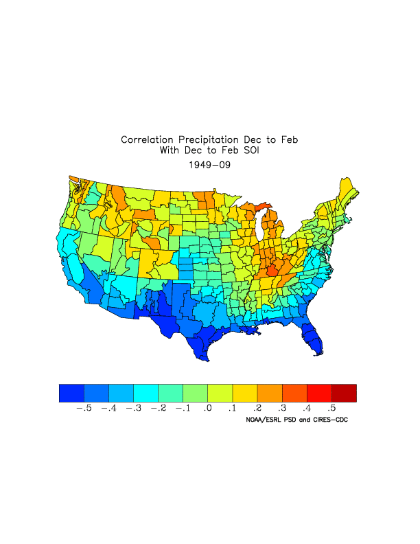
En respuesta a Marina Timofeyeva

Re: Section 2: How does the correlation work?

de Mark Ewens -
I chose looking at the 3.4 ENSO for the DJF time period and temperature across the USA. No real surprises here, as the signals for the positive phase of the ENSO 3.4 shows clearing across our region. I also ran a correlation for the SOI and found a slightly stronger correlation. I've used this site extensively over the past few years and find it invaluable as a diagnostic.
Adjunto DJF_SOI_Precip_Corr.gif
En respuesta a Marina Timofeyeva

Re: Section 2: How does the correlation work?

de Tina Stall -
I selected Precipitation as my variable from 1948 through 2010 for seasonal correclation with the Nino 3.4 index. I got 0.5 or higher for a good portion of the Southwest US, especially southern California. This tells me that our seasonal precipitation is reasonably well-correlated to El Nino, most likely giving us our highest precipitation values during those years as long as the El NIno signature is moderately strong to strong.
En respuesta a Marina Timofeyeva

Re: Section 2: How does the correlation work?

de Kristopher White -

This is my answer:

I chose to show winter season correlation between Nino 3.4 SST values and climate division precipitation values. However, I did time lead the SST values by one month. So, this is a NDJ SST correlation with DJF climate division precip. Why a lead?...just to see if there was any noticeable difference. There wasn't too much, at least for the TN Valley.

As can be seen, correlation values for the TN Valley region are quite small (on the order of about -0.1 to -0.2 inches). So, only a very small amount of the variance with precipitation is explained by Nino 3.4 SSTs. Since the correlation shows a slight negative value, then when SSTs are positive, precipitation may slightly trend in the negative, and vice versa. Unfortunately, this leads to our region residing in the Equal Chances area for precipitation in the CPC seasonal outlooks. We have, however, found a non-linear trend locally with respect to the magnitude of the SST anomaly in the 3.4 region. Although, statistical significance is still quite small.

Adjunto Correlation_Winter_onemonthlead_section2.gif
En respuesta a Marina Timofeyeva

Re: Section 2: How does the correlation work?

de Adam Baker -

The plot shows the correlation between DJF seasonal temperature and the Nino3.4 dataset from 1950-2010.  I would interpret this plot as showing the strongest relationship across the southeast, northwest, and northern midwest regions, since these areas are closest to the -0.5 and 0.5 values.  One could also interpret this further as during the winter, SST values in the Nino 3.4 region having the greatest impact on the aforementioned regions.

Adjunto stat_lab_correlation_plot.gif
En respuesta a Marina Timofeyeva

Re: Section 2: How does the correlation work?

de Jeremy Wolf -
I made a plot of PDO since it has been found that the phase of the PDO cycles on a 20-30 year period and has an impact on temperatures in the Northwest.  Data (other than the graphic I provided)shows that we are coming out of the positive phase which tends to bring warmer temperatures.  The graphic shows that there is a good correlation with warmer temperatures during the February through April period in the positive phase of the PDO for all of the Pacific Northwest. 
Adjunto PDO_Image.gif
En respuesta a Marina Timofeyeva

Re: Section 2: How does the correlation work?

de Mike Buchanan -
The attached map shows a strong positive correlation between Southern U.S. precipitation (La Nina years 2009 -2011) and the Nino3.4 region.

We chose this map because we are currently experiencing a record drought over South TX which appears to be strongly linked to the current La Nina episode.

Mike and John (CRP)
Adjunto climdivcorr.216.38.80.221.296.15.54.58.prcp.gif
En respuesta a Marina Timofeyeva

Re: Section 2: How does the correlation work?

de Matthew Kidwell -
I looked at Nino 3.4 for the DEC to FEB time frame for precipitation. It shows a weak to moderate correlation for northwest CA (0.2 to 0.3). I also check the other Nino indexes, but they showed similar results for that area.

Adjunto climdivcorr.gif
En respuesta a Marina Timofeyeva

Re: Section 2: How does the correlation work?

de Erik Heden -
I plotted NAO and Precip. Water (Dec-Feb). The highest correlation would be across the east, especially in the Mid-Atlantic with values approaching 0.4, suggesting more available moisture in the atmosphere when the NAO is negative.
Adjunto 198.206.35.146.296.16.0.2.gif
En respuesta a Marina Timofeyeva

Re: Section 2: How does the correlation work?

de Dean Hazen -
I thought I'd look at 3 elements for the NDJ season using a period of record 1981 to 2011. I wanted to see how the ENSO, NAO and PNA reflect on our (PIH) temps/precip for this season...Most graphs showed low to moderate correlation with precip generally showing the larger correlations. I've attached the largest correlation graphic which shows a correlation of .4 in the Central Mountains of Idaho. Temperatures generally showed low to moderate correlation with none above +/- .3

Adjunto PIH_ENSO_NDJ_Precip.gif
En respuesta a Marina Timofeyeva

Re: Section 2: How does the correlation work?

de Jared Klein -
I plotted a correlation between the MEI (Multivariate ENSO Index) and DJF precipitation between 1981-2010. The strongest correlations were across the far southern CONUS and over the northern Rockies/Great Lakes and Ohio Valley regions. Over the Baltimore/Washington forecast area a moderate correlation between increased winter precip and positive phase of the MEI.
Adjunto climdivcorr.198.206.34.142.296.16.13.19.prcp.gif
En respuesta a Marina Timofeyeva

Re: Section 2: How does the correlation work?

de Edward Ray -

I looked at the NAO for Oct-Apr and May-Sep versus temperature (default years). I had a strong positive correlation for Oct through Apr across the eastern CONUS, and Kentucky and a strong negative correlation for May through Sep across the southeastern CONUS, and Kentucky. I attached a file with the images. I chose the NAO because I've always been interested in its affect on our weather here.

En respuesta a Marina Timofeyeva

Re: Section 2: How does the correlation work?

de Chuck McGill -
I looked at the correlation between the winter (DJF) temps and the NAO. The strongest correlation is in the mid-Atlantic and southeast, with lesser correlation in the northeast.
Adjunto nao.gif
En respuesta a Chuck McGill

Re: Section 2: How does the correlation work?

de David Sharp -
Here is the correlation precipitation (Nov - Apr) with the Nino 3.4 precipitation (Nov - Apr) for a full seasonal perspective for Peninsular Florida cool/dry season; strong correlation.
Adjunto Cor_Precip_NovtoApr_2_Nino3dot4_Precip_NovtoApr.png
En respuesta a Marina Timofeyeva

Re: Section 2: How does the correlation work?

de Matthew Volkmer -

I chose to correlate Nino 3.4 with a 3 month lead time to Temperature for the Feb-Apr time frame which is the latter part of the dry season in East Central Florida. The results show a negative correlation from Texas to Florida over the Southeast U.S. and a positive correlation in the Pacific Northwest.

Maximum Correlation= 0.5716680

Minimum Correlation= -0.5274571

The .50 and higher correlations would lead one to assume predictive skill in forecasting Spring temperatures in these parts of the country from this index.

Adjunto climdivcorr_216_38_80_221_297_7_34_15_prcp.gif
En respuesta a Marina Timofeyeva

Re: Section 2: How does the correlation work?

de Vince Godon -

Global temperature change is a big topic of discussion these days. I picked this option because I think it is neat to see the effects of this across local areas. We have talked about how sensor siting and sensor characteristics can affect this topic. How much of global temperature change is actually related to these local characteristics...

Adjunto sample.gif
En respuesta a Marina Timofeyeva

Re: Section 2: How does the correlation work?

de Shawn Rossi -

I chose to correlate DJF temperatures with the ENSO 3.4 index. I chose this because there is some predictability of ENSO and I personally would like to know what effect (if any) we can expect the La Nina this winter to have on temperatures (as I'm not a big fan of the cold).

The attached plot shows there is a weakly positive correlation of temperatures across south central Nebraska during this time period. As a result, I would guess that this means that with a forecast La Nina (negative ENSO values) there is a small correlation with slightly cooler temperatures across our region this winter.

Adjunto hastings.gif
En respuesta a Marina Timofeyeva

Re: Section 2: How does the correlation work?

de Molly Woloszyn -
The image shows the correlation between the Palmer Drought Severity Index (PDSI) in the summer (June - August) with Nino 3.4 from 1950-2010.

In the west, there is generally a negative correlation between drought severity and Nino 3.4 during the summer. In the central and high plains region, there is a stronger correlation between the two. In Texas, there is a positive correlation between Nino 3.4 and the PDSI. This means that when Nino 3.4 is positive, so is PDSI (or drought conditions are more severe).

On the eastern half of the US, negative and positive correlations are mixed. The strongest positive correlation on the east coast is in Florida.
Adjunto climdivcorr.130.126.104.207.297.7.52.11.prcp.gif
En respuesta a Marina Timofeyeva

Re: Section 2: How does the correlation work?

de Andrew Loconto -
I looked at the NAO and its seasonal correlation to DJF 500mb heights from 1970-2010. The highest statistical correlations to NAO phase are found across the eastern third of the U.S. and across northeastern Canada and adjacent coastal waters. An image like this just sort of reinforces the idea that NAO phase affects wintertime 500mb heights over the eastern U.S. and northeastern Canada more significantly than across the western half of the nation (where the seasonal correlations are lower).

Andrew Loconto
Meteorologist Intern
WFO Burlington, VT
Adjunto nao.gif
En respuesta a Marina Timofeyeva

Re: Section 2: How does the correlation work?

de Lindsay Tardif-Huber -

I decided to correlate Nino 3.4 with temperatures for the winter (December-February) because we have done research in the past here at Bismarck looking at temperatures in the winter and their anomalies during El Nino and La Nina events. It looks like the strongest correlation in respect to temperatures and Nino 3.4 is across the northern tier of the US, with the weakest being across the south.

Adjunto climdivcorr_204_227_127_170_297_8_37_18_prcp.gif
En respuesta a Marina Timofeyeva

Re: Section 2: How does the correlation work?

de Kerry Jones -

I generated a plot showing the correlation between the PDSI and ENSO using the Multivariate ENSO Index. Moderately high positive correlations exist in Central NM.

climdivcorr.216.38.80.221.297.8.41.54.prcp.gif

En respuesta a Marina Timofeyeva

Re: Section 2: How does the correlation work?

de Adrienne Leptich -

We chose to correlate precipitation with NAO from Dec through Feb. From the graph below, you can see that there is a strong positive correlation in the Ohio, Tennessee and Mid-Mississippi Valleys. There is a negative correlation in portions of the Northern Plains, Northern New England and the Southeast. However, we were unable to determine whether the NAO was positive or negative.


Adjunto climdivcorr.gif
En respuesta a Marina Timofeyeva

Re: Section 2: How does the correlation work?

de Paul Sisson -
A one-month postive (negative )sea surface temperature anomaly of 0.5C or greater is observed in the Niño-3.4 region of the equatorial Pacific Ocean (5ºN-5ºS, 120ºW-170ºW) is an “El Nino” (La Nina)


TRENDS - APPROXIMATED BY THE OCN TOOL AS THE DIFFERENCE BETWEEN THE MOST
RECENT 10-YEAR MEAN OF TEMPERATURE OR 15-YEAR MEAN OF PRECIPITATION FOR A GIVEN
LOCATION AND TIME OF YEAR AND THE 30-YEAR CLIMATOLOGY PERIOD (CURRENTLY
1981-2010).
En respuesta a Marina Timofeyeva

Re: Section 2: How does the correlation work?

de Edward Ray -

I have attached a file with SOI and Nino3.4 correlations. I thought the SOI and Nino3.4 were related in the sense that the correlations would be similar. However, they seem to be the exact opposite. Can you explain this for me. Also, as a review...when we see a significant correlation, +/- 0.4 or stronger if I remember what was presented in class, is that the correlation to the positive index of that feature. For example, for Nino 3.4's positive phase, precipitation has a significant positive correlation (red) across the southern CONUS, which means drier weather on average? Is that correct, and if so is the exact opposite true for a negative 3.4? Just trying to get my head wrapped around this again.

Thanks ahead of time!

Ed